

How women’s health branding grew up
Why the fastest-growing brands in women’s health are combining clinical credibility, consumer-grade design and unapologetic honesty

For years, women’s health branding came wrapped in euphemism.
Period blood was blue. Menopause was beige. Pelvic pain hid behind flowers, soft gradients and vague promises of “balance” and “wellness”. Even products built for some of the most intimate and life-altering experiences in healthcare often looked either sterile enough for a hospital corridor or pastel enough for a baby shower.
Now the category looks very different with women’s health brands that are louder, sharper and more specific. Companies talk openly about vaginas, herpes, perimenopause, anorectal care and pelvic floor dysfunction. And they borrow visual cues from beauty, wellness and luxury consumer brands, while also leaning harder into evidence, data and medical credibility.
“The brands standing out right now are the ones making women feel both informed and understood,” says Taralyn Carver, Chief Creative Officer and Partner at BOLD LIP, a creative agency for women’s health.
“Women want more than a pretty wellness brand. They want transparency, real expertise and messaging that reflects the experiences and health concerns they’re actually navigating in their day-to-day lives.”
The shift is now reaching far beyond consumer startups and into hospital systems, patient safety programmes and healthcare institutions themselves.
From ‘safe’ branding to culturally confident brands

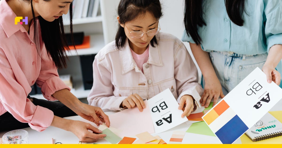
There is a reason so many women’s health startups from the last decade look strangely similar. The soft pinks, rounded fonts and muted illustrations were designed to reassure rather than provoke.
Partly, that reflected the reality of the sector itself. Women’s health sat at the edges of healthcare and consumer markets for years, and so founders were often trying to solve two problems at once: making taboo subjects feel socially acceptable enough to market in the first place, while also signalling quickly and clearly that these products were for women. In crowded pharmacy aisles and early consumer health markets, it was the pinks, softness and traditionally feminine visual cues that became shorthand for that identity.
But the wider culture has shifted.
Consumers increasingly self-manage their health. Preventative health has become aspirational - shaped by fitness culture, longevity trends and biomonitoring devices like Oura Ring. Tracking hormones, recovery and metabolic health sits alongside lifestyle and identity.
At the same time, conversations around fertility, menopause, ADHD, PMDD and gut health have become far more open online. Direct-to-consumer healthcare exploded during the pandemic, while wellness aesthetics merged with healthcare expectations.
“Women are more informed now and eager to have open, honest conversations about their health,” says Taralyn.
Some of the clearest examples can be seen in menopause branding.
“Brands like Stripes helped move menopause away from the pharmacy aisle aesthetic towards something closer to premium skincare,” says Taralyn.
Taralyn also points to smaller brands, such as Toronto-based LUME Clinic, whose warm, grounded identity reframes menopause care through what she describes as “elegant empathy”.
Meanwhile companies like Hertility have fused consumer-friendly branding with deeply data-driven positioning, turning clinical data itself into part of the brand promise.
“Women want the data and information to back up the purchase,” says Taralyn. “That’s the credibility and trust in a product. But they also want to see themselves reflected in it.”
Why specificity is replacing scale
One of the biggest shifts in women’s health branding is that smaller companies no longer need massive budgets to build recognisable brands.
Direct-to-consumer healthcare has changed the economics of visibility. Brands no longer rely on pharmacy shelves or traditional healthcare advertising to reach consumers; instead, they are building highly specific worlds around conditions, symptoms and life stages online.
“The brands doing this best know exactly who they are for,” says Taralyn. “They understand the audience deeply and make that person feel seen.”
That specificity increasingly matters more than broad “women’s wellness” messaging. Consumers may first encounter a company through TikTok, then move to a telehealth intake form, investor announcement or patient community.
“The strongest brands keep consistency across every touchpoint,” Taralyn says. “That’s where trust starts to build.”
The rise of ‘evidence branding’

Women’s health brands now use evidence as a design feature in itself.
Clinical icons, dosage information, trial data and ingredient transparency are becoming more prominent across packaging and websites.
“The language of healthcare is no longer being hidden in the small print,” says Taralyn. “Labels aren’t just about compliance anymore, we’ve seen them become a real competitive advantage.”
Consumers now scan skincare labels for active ingredients in the same way they once only scanned pharmaceutical leaflets - behaviour increasingly spilling into women’s health.
“Generic wellness won’t differentiate anymore,” says Taralyn. “The next challenge is owning a specific demographic and a specific problem.”
Saying the actual words
Another significant change in women’s health branding is linguistic. The new generation of brands use direct, medically accurate language rather than euphemism.
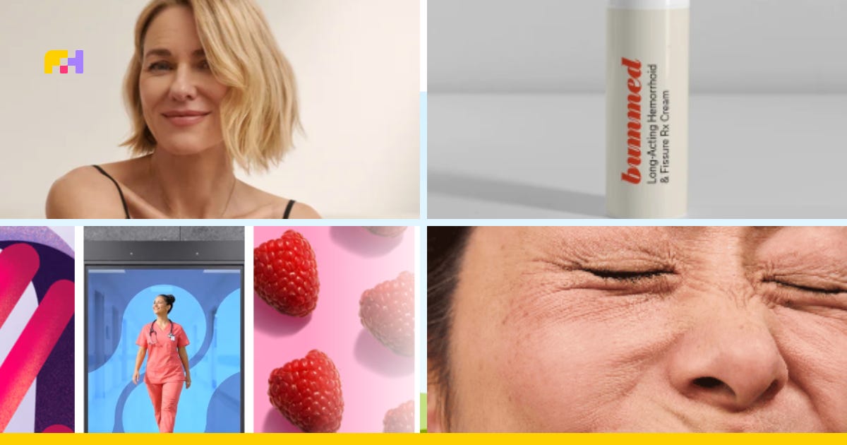
Jenny Dwork, co-founder of anorectal care platform Bummed, says she first saw the power of that approach during her time at telehealth company Wisp.
“We had campaigns that were literally just saying the word vagina,” she says. “At first I’d feel embarrassed talking about herpes campaigns in public. But the more you say these actual words, the more you take away the power they hold.”
That same thinking shaped Bummed - a company tackling constipation, fissures and hemorrhoids, including among users of GLP-1 weight loss drugs.
The brand deliberately balances humour and clinical credibility, with a playful name designed to lower the barrier to engagement.
“When you’re actually dealing with these issues, it’s no laughing matter,” Jenny says. “People are in pain and worried. So when they come to us, everything is grounded in science and getting them to a solution as quickly as possible.”
Even the language around the category became part of the branding exercise.
“I’d never even heard the term anorectal care before,” she says. “But once we started using it, it gave us a way to talk about these issues properly. It’s a real medical term. Let’s say it.”
Why healthcare branding is starting to look more human

Healthcare consultancies and hospital-facing organisations are grappling with the same questions too.
At Canadian healthcare quality and safety firm Salus Global, Director of Marketing and Communications Megan Hood says even traditionally B2B healthcare organisations are moving towards more human storytelling.
“The human connection - less clinical and more human - is something we’re seeing across healthcare,” she says.
That storytelling becomes especially powerful in areas like maternal health, where emotional experiences and patient outcomes are tightly intertwined.
And unlike many industries racing towards fully digital communication, healthcare still often functions through deeply human systems: bulletin boards, staff huddles, manager talking points and in-person team dynamics.
“The reality in healthcare is that everything has to work for care teams on the unit,” Megan says. “How they access information, how quickly they can act on it, and how partners like Salus Global support them in real time.”
It means healthcare branding increasingly has to work everywhere simultaneously: in investor decks, Instagram ads, patient education materials, hospital units and clinical conversations.
The danger of sameness
As women’s health matures, the reliance on muted palettes, serif fonts and visual sameness is making way for bolder, more relatable brands.
“There’s definitely an aversion now to making everything pink and floral,” says Taralyn. “Women aren’t all pink and flowers.”
“The strongest brands have a sharper point of view - they are the brands willing to clearly define who they are for, what problem they solve and what emotional reality they are reflecting back to consumers. Women want to see their actual challenge reflected.”
For agencies like BOLD LIP, this means designing brands that can hold both emotional resonance and scientific credibility at the same time.
“The strongest brands balance premium aesthetics with transparent information,” Taralyn says. “Women are asking: what’s in it? How much? What proves it? What exactly does this solve?”
What comes next
Women’s health branding is still early in its evolution.
The next phase is likely to become even more specific: more personalised care, more biomarker-driven products, more evidence-led storytelling and more brands built around defined life stages and conditions rather than broad “women’s wellness” positioning.
The companies that succeed will be the ones able to navigate both worlds at once: the emotional reality of women’s lived experiences and the clinical rigor consumers increasingly demand.
As founder Jenny puts it: “People want proof. They want evidence. But they also want to feel less alone.”