

Behind the scenes of the FutureFemHealth rebrand
I’ve been working with the team at BOLD LIP - a female-founded creative agency specialising in women’s health branding

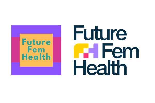
You may have noticed that FutureFemHealth has a fresh new look and feel this week.
Over the past few months, I’ve been working behind the scenes with the team at BOLD LIP - a female-founded creative agency specialising in women’s health branding - on a full rebrand.
And today, we’re finally launching it.
If you’ve been reading FutureFemHealth for a while, you’ll know this started life as a weekly newsletter. But over the past three years, it has evolved into a broader media platform and intelligence layer for women’s health.
The audience has evolved too. Today, FutureFemHealth is read by almost 10,000 founders, investors, clinicians, researchers, pharma leaders and policymakers across more than 100 countries.
The content has evolved. The ambition has evolved.
And honestly, the brand hasn’t caught up.
So, as a follow-up to my last article reflecting on three years of FutureFemHealth, I’m sharing the behind the scenes on how this rebrand came to fruition.
Starting with the strategy and a deep dive into the why
My starting point with BOLD LIP was what the team called our first BOLD SESSION™ - a deep-dive brand strategy workshop into every part of the FutureFemHealth ecosystem. Not just the logo, but the Substack experience, the social templates, the typography, the imagery, the audience psychology and even the emotional tone of the platform itself.
This process challenged me to articulate the long term strategy for the business, and reflect on what I like and didn’t like about how FutureFemHealth showed up.
When I first “branded” FutureFemHealth, I chose a colour palette and font, and then let the brand shape itself through the stories I shared. BOLD LIP showed me that my visual identity (the logos, fonts, photography, colours) and content had equal importance to shaping the brand experience for our readers.
For example, the BOLD SESSION™ workshop was a positioning exercise mixed with media psychology.
Within minutes, we weren’t talking about logos anymore. We were talking about credibility.
“We are not a personal blog. We are not a wellness site. We are news first,” the BOLD LIP team wrote during one of the exercises.
And that sentence became a sort of anchor for the whole process.
Building a brand identity at the intersection of media and women’s health
One of the challenges I’ve seen with branding in women’s health is that the category still tends to swing between two extremes: overly clinical and inaccessible, or overly aesthetic and wellness-led. Somewhere between biotech, supplements, fertility apps and Instagram self-care culture, a lot of women’s health brands risk starting to look and sound the same.
A media and intelligence platform like FutureFemHealth isn’t any of those things. The team at BOLD LIP understood that too. Our brand needs to convey trust, credibility, and authority. We couldn’t let FutureFemHealth become too cold, overly academic or corporate either.
So the challenge was finding a middle ground. The workshop became surprisingly forensic.
We went through everything from how headlines should sit on images, to why certain photography works better than others, to the difference between a “news” aesthetic and an “editorial magazine” aesthetic. We discussed why some women’s health imagery feels clichéd, why certain fonts immediately feel more trustworthy, and how much visual consistency affects how seriously a platform is perceived.
At one point, the team analysed my existing graphics one-by-one and gently pointed out something I already knew deep down: the platform had outgrown the “quick Canva template” phase.
Building a manageable brand system
Rather than overcomplicate things, another major benefit to BOLD LIP’s process was that it focused heavily on systems. FutureFemHealth doesn’t have a dedicated designer. It’s largely a team of one (me!) - so the brand needed to be easy for me, a non-designer, to apply quickly and consistently. For any solo founders or small teams simplicity is absolutely critical when considering a new brand rollout.
How do you create a visual identity that still works when you’re publishing quickly every week (often every day)? How do you make complex health and tech stories feel engaging without becoming over-designed? How do you build templates flexible enough to work across LinkedIn, Substack, reports, market maps and future research products?
Two distinct creative directions
A few weeks later, BOLD LIP returned with two completely different creative directions.
The first felt like a natural evolution of FutureFemHealth: bold typography, structured layouts, vibrant colours grounded by darker tones, and a visual system designed to separate news, opinion and intelligence content without overwhelming the reader.
The second was quite different. More editorial. More graphic-led. Slightly outside my comfort zone.
What was fascinating was seeing how the concepts weren’t just different “looks” - they reflected entirely different interpretations of what FutureFemHealth could become.
Immediately, option one felt like it captured everything I had vocalised during our workshop. The final direction we landed on intentionally kept elements of the original FutureFemHealth energy and boldness - particularly the brighter colour palette - while bringing in far more structure, consistency and polish.
A flexible brand system for FFH content categories
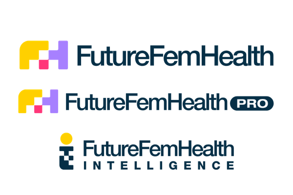
FutureFemHealth isn’t one publication. As we’ve grown, we’ve adopted content categories, like FFH Pro (the new paid subscription layer), FFHintelligence (our category-shaping deep dives and analysis which now sit within FFH Pro), and FFH, that each need a distinct identity that fit within the overarching brand system. The brand architecture solved that with “category tags.”
One of the things I liked most about the concept was that it didn’t try to strip away personality in the name of looking “corporate”. Instead, the branding system was designed to balance credibility with accessibility: clean typography, strong layouts and modular graphic elements that could flex across news, opinion, intelligence reports, social content and future research products.
The geometric FFH symbol itself was developed as part of a broader visual system rather than simply a standalone logo - something scalable and recognisable that could work across the entire platform ecosystem without overwhelming the journalism and analysis at the centre of the brand.
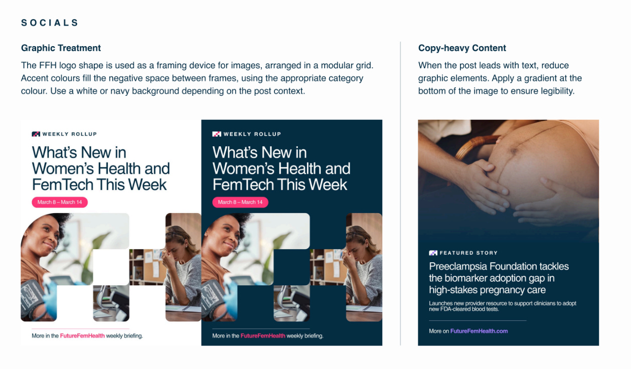
From there, the process became iterative: refining colour systems, testing imagery treatments, reviewing how the branding translated across social media and Substack, simplifying templates, tightening typography and building out a full visual identity system that could actually scale alongside the platform.
And the process reminded me that branding is far less about aesthetics than people think. The visuals are really just the outward expression of clarity. It’s about helping people instantly understand what you are, what you stand for and why they should trust you.
For women’s health especially, that matters.
Because this industry doesn’t just need more innovation. It also needs the infrastructure around it: trusted media, intelligence, visibility and platforms that help the sector feel credible, connected and investable.
That’s what this next chapter of FutureFemHealth is really about.
And I’m very excited for you to finally see it.
A final note on BOLD LIP
None of this would exist without the team at BOLD LIP. If you’re a founder building in women’s health, health-tech, or media, and you’re ready to move past “good enough” branding into something that actually positions you, talk to them. They’re the team I’d send you to without hesitation.
I loved reading about the evolution and the strategy behind it.